A landing page isn’t just another page on your website, it’s your digital salesperson. And unlike a human salesperson, it works 24/7. Whether you’re running Meta Ads, Google Ads, or organic campaigns, your landing page decides whether visitors leave instantly or convert into leads or customers.
But here’s the truth most businesses ignore:
Traffic doesn’t matter unless your landing page converts.
Even the best ads fail if the landing page is confusing.
Small changes in landing pages often create massive revenue jumps.
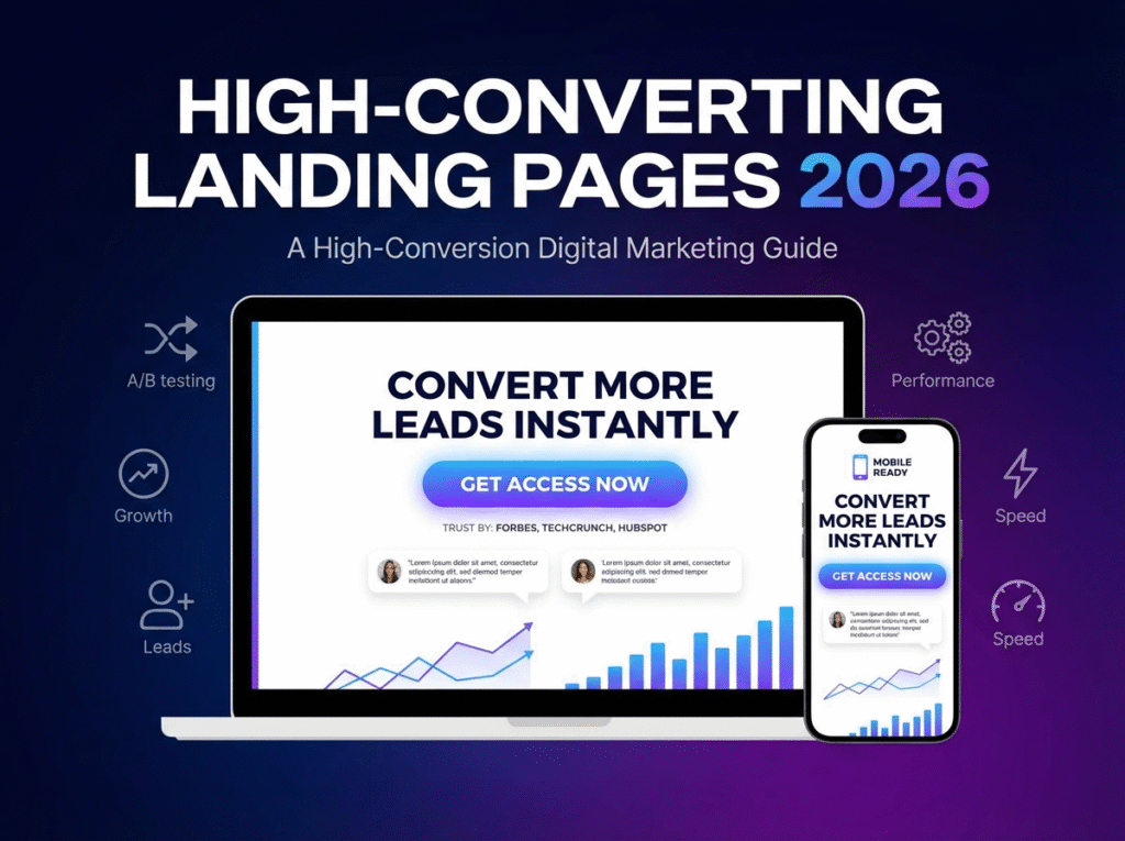
This guide explains exactly how businesses in 2025 can create landing pages that don’t just look beautiful but actually convert.
1️. Start With a Single, Clear Objective
Every high-performing landing page has one purpose only.
Not “Sign up + learn more + check our services + read our story.”
Just one.
Examples:
- Download the eBook
- Book a Free Consultation
- Signup for demo
- Buy product
- Claim discount
When your objective is sharp, your content becomes focused, and your conversions improve instantly.
Confusion kills conversions. Clarity wins.
2️. Craft a Headline That Hooks in 3 Seconds
Your headline is the first impression and visitors decide in 3 seconds whether they want to continue reading.
A high-converting headline:
- Is simple
- Is benefit-driven
- Speaks to a pain point
Examples of powerful headlines:
- “Get 5X More Leads With Our AI-Powered Marketing System”
- “Transform Your Skin With 100% Chemical-Free Products”
- “Launch a Modern Website in 7 Days Without Coding”
A strong headline increases scroll depth and reduces bounce rate.
3️. Use a Subheadline That Complements the Promise
If your headline creates impact, your subheadline should add clarity.
Example:
Headline:
“Grow Your Business With Predictive Marketing”
Subheadline:
“Our data-driven automation helps you convert more customers without increasing ad spend.”
This combination locks the user’s interest.
4️. A Clean Hero Section Converts Better Than Fancy Designs
The hero section is the “make or break” part of your landing page.
Keep it:
- Minimal
- Fast-loading
- Laser-focused
Your hero section must include:
✔ A powerful headline
✔ One-line subheading
✔ A strong call-to-action button
✔ A clean visual (mockup, product photo, or illustration)
✔ Trust badges or client logos
Avoid clutter simplicity sells.
5️. Highlight Benefits, Not Features
Most landing pages fail because they talk too much about features.
But users don’t care about features.
They care about results.
Example:
Feature: “We use advanced AI algorithms.”
Benefit: “Get 3X more conversions with smarter targeting.”
Always communicate how your product/service improves the user’s life.
6️. Social Proof: The Trust Accelerator
People trust people not brands.
Add:
- Reviews
- Testimonials
- Client logos
- Case studies
- Before/after results
- User-count badges
The more proof you show, the faster the user trust is built.
Pro Tip:
Position testimonials close to the CTA for maximum impact.
7️. Use High-Quality Images and Videos
Visuals impact decision-making.
Your images should:
- Look clean and professional
- Represent your product honestly
- Avoid looking like stock photos
For services, use:
- Process images
- Before-after shots
- Video testimonials
A 30–45 second explainer video can boost conversions by 20–80%.
8️. Remove Every Distraction
Landing pages should not feel like a full website.
Avoid:
- Navigation menus
- Multiple buttons
- External links
- Pop-ups that interrupt
Let the user focus on only one action.
Remember:
Every click you allow is a potential conversion leak.
9️. Create Clear, Conversion-Driven CTAs
Your CTA button should be:
- Big
- Bold
- Clear
- Action-driven
Examples of effective CTA texts:
- “Get Free Demo”
- “Download Now”
- “Claim Offer”
- “Start My Free Trial”
- “Get Instant Quote”
Avoid generic CTAs like:
“Submit”
“Click here”
Your CTA should feel like the next logical step.
10. Use Pain Points to Create Emotional Connection
Customers convert when they feel understood.
Add a section showing common pain points your target audience faces.
Example (for digital marketing services):
Not getting quality leads?
Your ads are expensive but not converting?
No proper marketing strategy?
Then show HOW your solution fixes each pain.
This creates a powerful “you understand me” moment.
1️1. Break Down Your Process Into Simple Steps
People fear complexity.
Show your process in 3–5 simple steps to reduce anxiety.
Example:
- Book a call
- We analyze your business
- Get your custom strategy
- Watch your results grow
Simple = trustworthy.
1️2. Add FAQs to Remove Last-Minute Doubts
FAQs address the objections that stop users from converting.
Include answers for:
- Pricing
- Refund policy
- Support
- Security
- Who it’s for
- How it works
The more objections you remove → the higher your conversions.
1️3. Make It 100% Mobile-Optimized
65% to 80% of landing page traffic is mobile.
Check:
- Button size
- Font size
- Spacing
- Image compression
- Speed
- Scroll experience
A landing page that looks great on desktop but messy on mobile will never convert.
1️4. Prioritize Page Speed
A 1-second delay can reduce conversions by 7–20%.
Optimize:
- Use WebP images
- Minify CSS & JS
- Enable lazy loading
- Use fast hosting
- Remove unnecessary animations
Speed is a direct conversion factor in 2025.
1️5. Test, Improve, Test Again
High-converting landing pages are not built once they are built through continuous optimization.
Test:
- Headlines
- CTA colors
- Button position
- Images
- Testimonials
- Offer structure
Small A/B tests often increase conversions dramatically.
A high-converting landing page is a combination of:
Strong messaging
Clean design
Trust-building elements
A clear CTA
Mobile-first performance
If your page solves a problem clearly and reduces user friction, it will convert.
The best part?
You don’t need a fancy design you need a strategic structure.